Create Vue 3 SlideOver dialog component with tailwind css
Imagine you're on a website, and you want to show extra stuff when you click a button, without making the page messy. That's where the "Slide Over Dialog" comes in. It's like a secret compartment that slides in when you need it.
Slide Over Dialog Component:
This is like the box that appears when you click the button.
- It has a nice sliding effect when it appears and disappears. So it looks smooth and cool.
- Inside the box, there's a title at the top, and a button with an "X" that you can click to close the box.
- The middle part is like a blank spot where you can put different things. It's like a place for different content, like pictures, text, or whatever you want.
- Create a component in your components directory or wherever you wish to. Copy and paste the below code name it as `SlideOverDialog.vue`. Of course you can name it however you see fit, but do not forget to update the usages accordingly.
SlideOverDialog.vue
<template>
  <transition name="slide">
    <div v-if="isOpen" class="fixed inset-0 overflow-hidden z-50">
      <div class="absolute inset-0 bg-gray-500 opacity-75"></div>
      <div class="fixed inset-y-0 right-0 pl-10 max-w-full flex">
        <transition name="slide">
          <div v-if="isOpen" class="w-screen max-w-md bg-white shadow-xl">
            <div class="p-4">
              <div class="flex justify-between items-center">
                <h2 class="text-lg font-semibold">{{ title }}</h2>
                <button
                  @click="close"
                  class="text-gray-500 hover:text-gray-700 focus:outline-none"
                >
                  <svg
                    class="h-5 w-5"
                    fill="none"
                    stroke="currentColor"
                    viewBox="0 0 24 24"
                  >
                    <path
                      stroke-linecap="round"
                      stroke-linejoin="round"
                      stroke-width="2"
                      d="M6 18L18 6M6 6l12 12"
                    ></path>
                  </svg>
                </button>
              </div>
              <div class="mt-4">
                <slot></slot>
              </div>
            </div>
          </div>
        </transition>
      </div>
    </div>
  </transition>
</template>

<script setup>
import { ref, defineProps, defineEmits } from "vue";

const props = defineProps({
  isOpen: Boolean,
  title: String,
});

const emit = defineEmits();

const close = () => {
  emit("update:isOpen", false);
};
</script>

<style>
.slide-enter-active,
.slide-leave-active {
  transition: transform 0.3s ease;
}
.slide-enter-from,
.slide-leave-to {
  transform: translateX(100%);
}
</style>
Usage:
In the parent component call the newly created component. Pass a title and the boolean `is-open` prop. Handle the toggling of the slide over with your defined methods. Example:
<template>
<div>
<button
@click="openDialog"
class="bg-blue-500 text-white px-4 py-2 rounded"
>
Open Dialog
</button>
<SlideOverDialog
:is-open="dialogOpen"
@update:is-open="closeDialog"
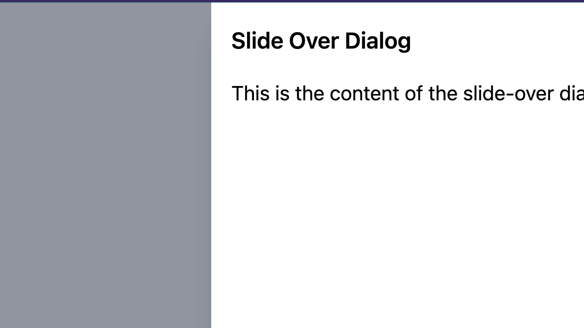
title="Slide Over Dialog"
>
<p>This is the content of the slide-over dialog.</p>
</SlideOverDialog>
</div>
</template>
<script setup>
import { ref } from "vue";
import SlideOverDialog from "@/components/SlideOverDialog.vue";
const dialogOpen = ref(false);
const openDialog = () => {
dialogOpen.value = true;
};
const closeDialog = () => {
dialogOpen.value = false;
};
</script>
This is where the action happens. You interact with the box here.
- There's a button you can click. When you click it, the magic begins!
- The box we talked about earlier pops up when you click the button. You can put all sorts of things inside it.
- When you're done, you can close the box by clicking the "X" button. The box slides away when you do that.
So, in simple terms, you've got a button that shows a box with stuff when you click it. And you can hide the box whenever you're done. It's like a tiny secret room that appears and disappears on the website. Thanks for reading and I hope you like it, Feel free to ask me any questions.
Related PostsView all posts
In this tutorial, we'll walk you through the steps... Read more
Rezaul H Reza,29 December 2022
"In this tutorial, we will learn how to create a C... Read more
Rezaul H Reza,27 December 2022Comments (0)